Table of Contents
- Prerequisites
- Setting Up the Environment
- Using IPython’s display() Function for DataFrames
- Mixing print() and display()
- Multiple Plots in One Jupyter Cell
- Creating and Exploring a Custom Dataset with Pandas
- Quick Data Inspection
- Data Manipulation
- Filtering and Selecting Data
- Data Visualization with Matplotlib
- Conclusion
Data analysis and visualization are at the core of data-driven decision-making. As data gets increasingly complex, having a powerful machine can speed up these processes, especially when you have machine learning or deep learning tasks that rely heavily on GPU. An Ubuntu GPU server is a great balance of performance, flexibility, and open-source tooling—perfect for data analysts, data scientists, and anyone who wants to experiment with large datasets quickly.
Pandas provide powerful data structures (DataFrames) and data manipulation and analysis tools. Matplotlib is a popular plotting library for creating static, animated, and interactive visualizations.
In this article, we will discuss setting up an environment for data analysis using Pandas and Matplotlib, inspecting and manipulating data, and visualizing the results.
Prerequisites
- An Ubuntu 22.04 Cloud GPU Server.
- CUDA Toolkit, cuDNN Installed.
- Jupyter Notebook is installed and running.
- A root or sudo privileges.
Setting Up the Environment
First, install the required Python packages and other libraries. Run the following command:
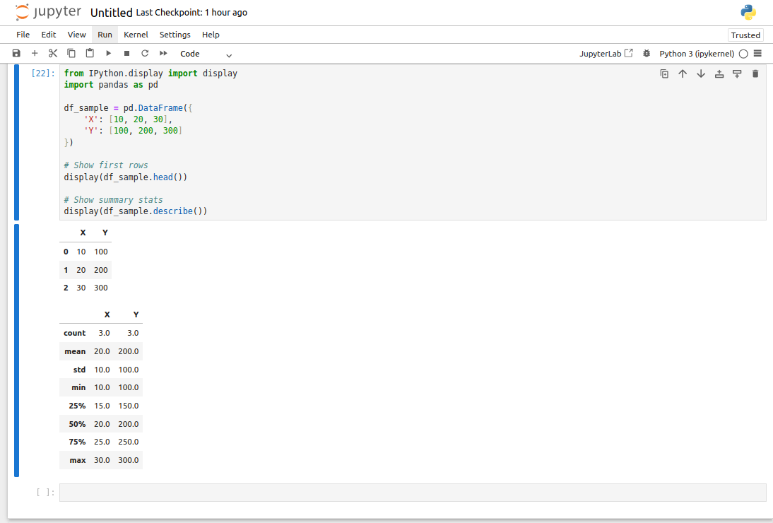
pip install pandas matplotlib jupyter numpy scipy seaborn scikit-learnUsing IPython’s display() Function for DataFrames
In a Jupyter Notebook, you can display Pandas DataFrames neatly by using the display() function from IPython instead of the standard print() function.
from IPython.display import display
import pandas as pd

df_sample = pd.DataFrame({
    'X': [10, 20, 30],
    'Y': [100, 200, 300]
})

# Show first rows
display(df_sample.head())

# Show summary stats
display(df_sample.describe())
In this code:
- display() renders the output in a more readable, table-like format inside Jupyter notebooks.
- df_sample.head() shows the first five rows of the DataFrame.
- df_sample.describe() provides summary statistics such as mean, standard deviation, etc.
Mixing print() and display()
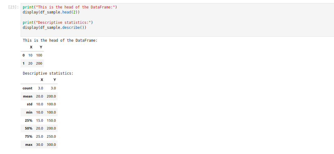
Sometimes, you may want to include text messages before displaying DataFrames:
print("This is the head of the DataFrame:")
display(df_sample.head(2))

print("Descriptive statistics:")
display(df_sample.describe())
Explanation:
- print() is good for showing plain text or messages.
- display() handles DataFrames gracefully, giving a well-formatted table output.
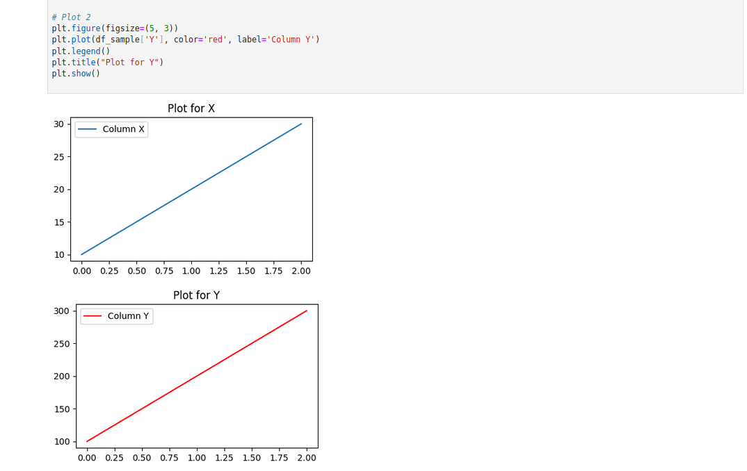
Multiple Plots in One Jupyter Cell
While analyzing data, you might need multiple charts to compare different aspects of your dataset. With Jupyter, you can display multiple plots one after another in the same cell:
import matplotlib.pyplot as plt
%matplotlib inline

# Plot 1
plt.figure(figsize=(5, 3))
plt.plot(df_sample['X'], label='Column X')
plt.legend()
plt.title("Plot for X")
plt.show()

# Plot 2
plt.figure(figsize=(5, 3))
plt.plot(df_sample['Y'], color='red', label='Column Y')
plt.legend()
plt.title("Plot for Y")
plt.show()
Here:
- %matplotlib inline tells Jupyter to display the plots inline within the notebook.
- plt.figure(figsize=(5, 3)) defines the size of each figure.
- plt.show() is used to display the figure.
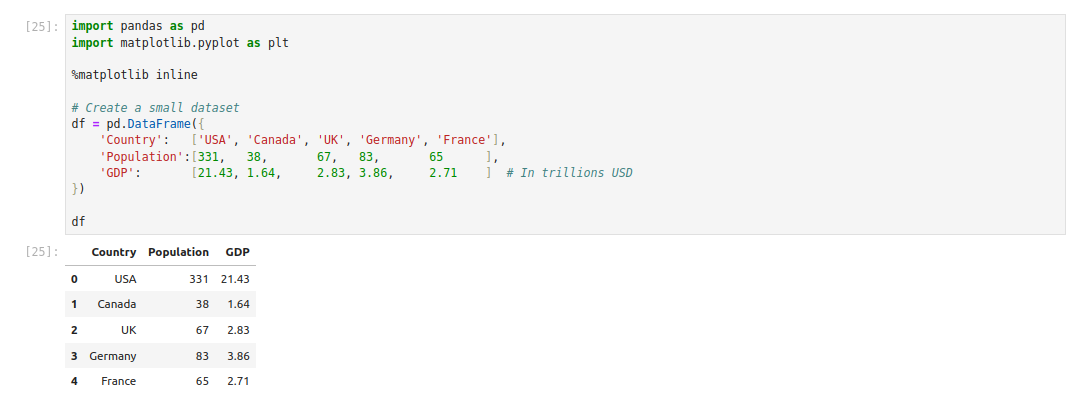
Creating and Exploring a Custom Dataset with Pandas
Here’s an example of creating a small dataset demonstrating basic Pandas functionality.
import pandas as pd
import matplotlib.pyplot as plt

%matplotlib inline

# Create a small dataset
df = pd.DataFrame({
    'Country':   ['USA', 'Canada', 'UK', 'Germany', 'France'],
    'Population':[331,   38,       67,   83,       65      ],
    'GDP':       [21.43, 1.64,     2.83, 3.86,     2.71    ]  # In trillions USD
})

df
In this code:
- We are creating a DataFrame with columns Country, Population, and GDP.
- Population is in millions, while GDP is in trillions (USD).
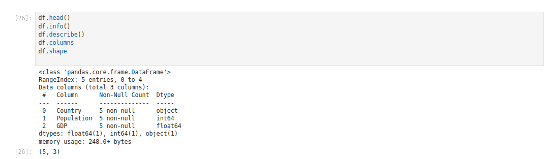
Quick Data Inspection
After creating your DataFrame, you can inspect it using some useful Pandas methods:
df.head()
df.info()
df.describe()
df.columns
df.shape
Explanation:
- df.head() and df.info() give you a quick overview of the data structure.
- df.describe() helps you identify the central tendency and dispersion of numeric columns.
Data Manipulation
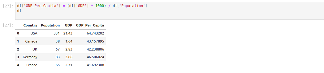
Adding new columns or transforming existing ones is straightforward in Pandas. For example, calculating GDP per capita:
df['GDP_Per_Capita'] = (df['GDP'] * 1000) / df['Population']
df
This formula multiplies GDP by 1000 (to convert from trillions to billions), then divides by the population in millions to get GDP per capita in thousands of USD.
Filtering and Selecting Data
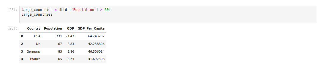
If you want to filter countries based on specific criteria (e.g., large population), you can do:
large_countries = df[df['Population'] > 60]
large_countries
In this code, df[‘Population’] > 60 produces a boolean mask for rows with a population greater than 60 million, and slicing the DataFrame with this mask returns only those rows.
Data Visualization with Matplotlib
Visualizing your data can reveal patterns, trends, and insights not immediately apparent from raw data.
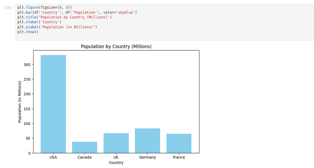
Bar Chart (Vertical)
plt.figure(figsize=(8, 5))
plt.bar(df['Country'], df['Population'], color='skyblue')
plt.title('Population by Country (Millions)')
plt.xlabel('Country')
plt.ylabel('Population (in Millions)')
plt.show()
Explanation:
- plt.bar(x, height, …) creates a bar plot where each country is on the x-axis and the height is its population.
- plt.title() adds a title to your chart, while plt.xlabel() and plt.ylabel() define axis labels.
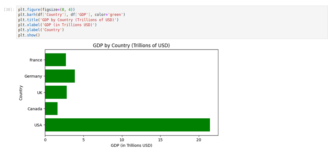
Bar Chart (Horizontal)
plt.figure(figsize=(8, 4))
plt.barh(df['Country'], df['GDP'], color='green')
plt.title('GDP by Country (Trillions of USD)')
plt.xlabel('GDP (in Trillions USD)')
plt.ylabel('Country')
plt.show()
Explanation:
- plt.barh() is the horizontal variant of the bar plot.
- We set color=’green’ for a different aesthetic.
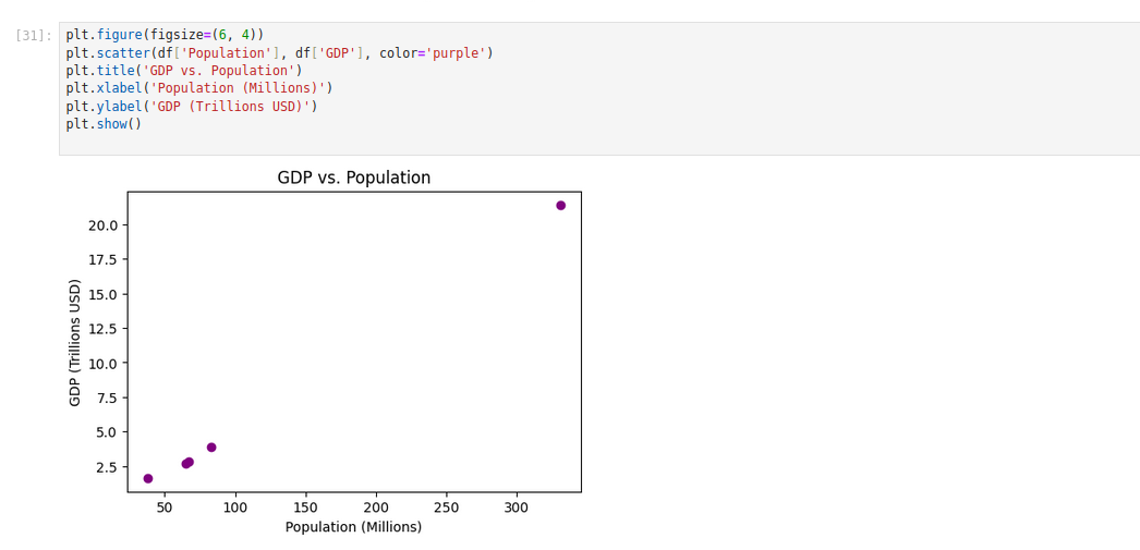
Scatter Plot
plt.figure(figsize=(6, 4))
plt.scatter(df['Population'], df['GDP'], color='purple')
plt.title('GDP vs. Population')
plt.xlabel('Population (Millions)')
plt.ylabel('GDP (Trillions USD)')
plt.show()
A scatter plot is perfect for showing the relationship between two continuous variables—here, Population and GDP.
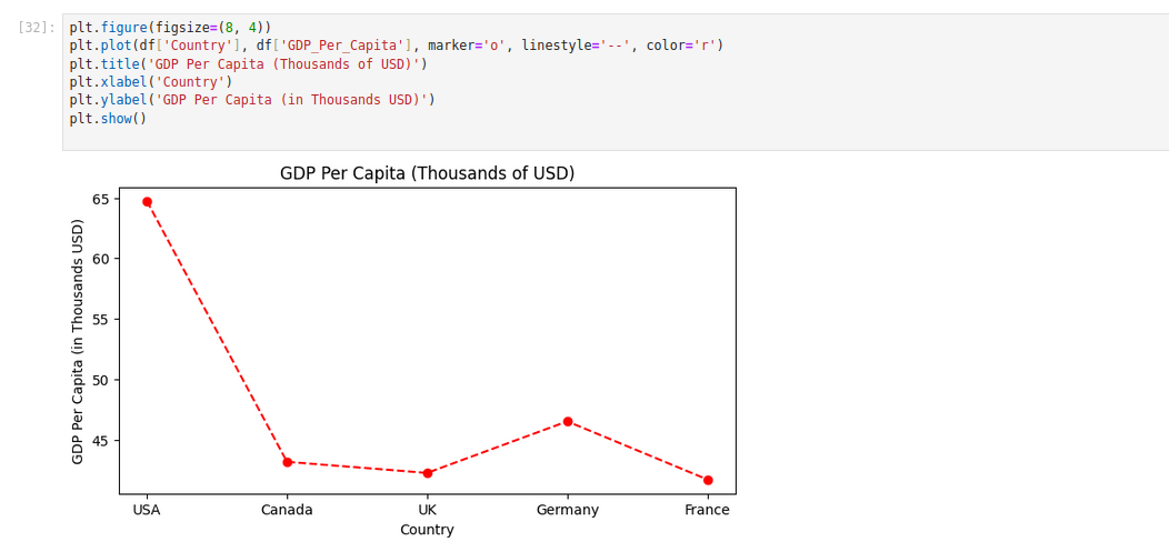
Plotting a Computed Column
Finally, you may want to plot the computed GDP_Per_Capita column:
plt.figure(figsize=(8, 4))
plt.plot(df['Country'], df['GDP_Per_Capita'], marker='o', linestyle='--', color='r')
plt.title('GDP Per Capita (Thousands of USD)')
plt.xlabel('Country')
plt.ylabel('GDP Per Capita (in Thousands USD)')
plt.show()
In this code, we use plt.plot() with markers and a dashed line to create a simple line plot.
Conclusion
In this tutorial, we went through the steps to analyze and visualize data using Pandas and Matplotlib on an Ubuntu GPU server. We set up the environment and installed the required libraries, used Jupyter Notebook’s display() function to show DataFrames nicely, inspected data, manipulated data,a and finally visualized the results.
* This post is for informational purposes only and does not constitute professional, legal, financial, or technical advice. Each situation is unique and may require guidance from a qualified professional.
Readers should conduct their own due diligence before making any decisions.